Collections
All
Featured
Wallpapers

Iconic UI Concepts

Ironic UI Concepts
Metro UI Concepts
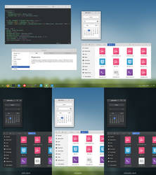
Desktop Customization
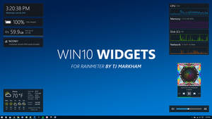
Rainmeter
Visual Styles

Icons + Cursors + Start Buttons
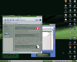
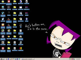
Desktop Screenshots
Old Screenshots

Emotes

Tutorials, Reference and Utilities
Back in the distant year of 2012, I had an addiction to Metro UI. I was so hyped for it the first time I saw that mockup that Microsoft did back then. I found every good concept I could probably find on dA back then, and favorited them. But when Windows 8 came out... I was disappointed on how it felt weird to use on desktops. It's such a shame, 'cause I really liked how it looked. Now it's 2015 (at the time of writing), and Metro is now being dumped for a similar (but not the same) design language in Windows 10 called Threshold, which has more hamburger menus and less panoramic scrolling. I made this collection to remember the good ol' days of looking at Metro concepts before realizing Metro was horrible to use with a keyboard and mouse. Enjoy! (Note: there are a lot of good and bad concepts here. I just pick what I can find.)